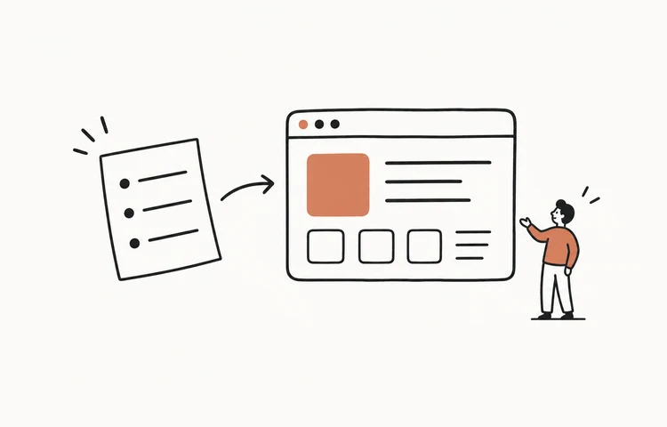
A useful design critique checks a design against a stated user task. Share the relevant states, separate visible observations from possible consequences, discuss alternatives, and finish with an owner and verification step for each decision. Agreement in the room does not establish that users can complete the task.
Choose a question the design can answer
For this worked session, a community center is reviewing a free workshop registration flow. The question is: can a first-time visitor choose the right session, review the details, and tell whether a place has been reserved? The session covers the event page, review page, confirmation, and full-session state. Brand strategy and future membership features are outside this discussion.
NN/g’s guidance on design critiques emphasizes agreed objectives, a bounded discussion, and feedback expressed as conversation. That matters because “make it cleaner” gives the designer no condition to satisfy. A concrete task lets the group examine whether the page supplies the information needed for a decision.
Send the four states and the brief before the meeting. Include known constraints: two sessions, fixed capacity, no payment, and registration from a phone as well as a desktop. State which claims come from research and which are assumptions. If no participant study exists yet, ask the critique to identify hypotheses to check.
| Brief field | Worked input |
|---|---|
| Actor | First-time visitor choosing a workshop session |
| Outcome | Correct session reserved; date, venue, and reservation status understood |
| Artifact | Event page, review page, confirmed state, full-session state |
| Open question | Does the review page make the selected session and final action clear? |
| Decision owner | Product owner; designer owns the revised flow |
| Out of scope | Membership accounts, paid tickets, and visual rebranding |
Borrow the decision pattern, not just the appearance
The GOV.UK check-answers pattern offers a concrete reference: people review answers before submitting, with change links attached to the relevant answers. The useful design decision is locality. A person correcting a session should not have to infer which previous page contains it.
Apply that reasoning to the workshop. Show the selected session, date, start time, venue, and contact address as reviewable rows. Put “Change session” beside the session row, and label the final button “Reserve my place.” A reference pattern helps form a proposal; it does not prove that this particular wording or layout will work for every audience.
Also bring the full-session and uncertain-submit states into view. Critiquing only the successful screen can produce a polished review page whose final action gives a misleading result when availability changes.
| Draft detail | Concrete design question | Candidate revision |
|---|---|---|
| Large hero image above review details | Does it push the selected session out of view on a phone? | Reduce the image in the review step; lead with the selection |
| Button says Continue | Does clicking reserve a place or open another page? | Use Reserve my place if it performs the reservation |
| Single Edit link at the bottom | Which answer will it edit, and will other answers survive? | Put a named change link beside each editable row |
| Green tick with Thanks | Can the visitor identify the reserved session? | Show confirmed status, session, venue, and reference |
Use a 30-minute agenda
Assign a facilitator and a note-taker. The presenter should explain the task and constraints before defending individual details. Start with a quiet inspection so the first senior person to speak does not define everyone else’s interpretation.
Keep discussion anchored to the artifact. Ask “Which screen or state are we discussing?” when a comment becomes general. When a disagreement needs user evidence, capture the competing expectations instead of spending the entire session voting on what users will do.
The final minutes are for decisions. If time runs out, an unresolved concern needs an owner and next step. A page of unassigned sticky notes is not a usable outcome.
| Time | Activity | Output |
|---|---|---|
| 0–3 minutes | Presenter states task, constraints, and requested feedback | Shared question |
| 3–7 minutes | Silent inspection of all four states | Specific observations |
| 7–18 minutes | Round-robin discussion, grouped by task risk | Concerns and alternatives |
| 18–25 minutes | Compare proposals against constraints | Decisions and open questions |
| 25–30 minutes | Read back owners and verification steps | Agreed follow-up record |
Turn vague comments into inspectable feedback
A practical feedback sentence has three parts: what is visible, what that might mean for the task, and what should be explored. The middle part is a hypothesis unless there is actual research to support it. That distinction keeps confidence from being mistaken for evidence.
For example: “The date appears only on the previous screen. Someone reviewing an afternoon session may not notice they chose the wrong day. Could we repeat the date alongside the time?” The observation can be checked immediately, and the proposed change addresses a specific failure.
Positive feedback needs the same precision. “The session row includes the date and venue, so this is the information we should preserve when compressing the layout” helps the designer keep a useful property. “Looks great” does not identify what made it useful.
| Unhelpful comment | More useful feedback |
|---|---|
| Make this cleaner | The banner separates the chosen session from the final button; try grouping them so the commitment is visible together. |
| Users will be confused | The button says Continue although it creates a reservation; check whether people expect another review step. |
| I prefer a modal | If editing opens a modal, can people return with their other answers intact and keyboard focus restored? Compare that with a separate edit step. |
| We need more delight | After submission, the current screen omits the event location. Resolve that information gap before adding animation. |
Close with decisions, not a consensus score
Here is a possible record from the worked critique. It deliberately distinguishes changes the team can make from questions that need observation. A requirement to display the confirmed session can be accepted directly; a prediction that a shorter page will improve completion still needs testing.
If a suggestion is rejected, keep the reason. Otherwise it can return at the next meeting as if nobody considered it. Avoid treating the number of votes as a substitute for task evidence, especially when one concern involves lost input or an inaccessible control.
Have the designer read back the decisions to catch ambiguity. “Fix confirmation” is too broad; the record should name the information, relevant state, and review condition.
| Decision | Reason | Owner and check |
|---|---|---|
| Adopt named change links | Each answer needs an identifiable edit route | Designer: prototype each route with retained input |
| Rename final action | Current label does not describe the commitment | Content designer: use Reserve my place; test expected next step |
| Defer celebration animation | It does not resolve missing confirmation details | Product owner: reconsider after the core outcome is clear |
| Investigate unknown submission | Network loss can leave reservation status uncertain | Engineer: define status lookup; researcher: test recovery comprehension |
Verify the revised flow and reuse the record
The follow-up should include the same states that were critiqued. Ask a participant to reserve the afternoon session, change their contact address, and explain the result. Observe what they do without coaching them through the exact labels you just chose.
Test the full-session branch separately: the person should understand that no place in that session was reserved and see a useful next action. For an uncertain submission, they should check the existing request rather than create an unnecessary duplicate. Record behavior and remaining uncertainty before calling the revision successful.
For the next critique, reuse this short record: artifact version; user task; observation; possible task consequence; proposal; decision; owner; verification; status. Link the revised artifact to the original record so the group can see which concern each change addresses.